Typography is so much more than just choosing a beautiful font: it’s one of the most essential elements of graphic design. It’s the vessel that carries the content to the reader’s mind. Good typography conveys a certain mood or feeling and holds the reader’s attention. It’s a designer’s tool to add harmony and personality to an otherwise bland block of text. Or as Hermann Zapf, world-famous type designer, puts it: “Typography is two-dimensional architecture, based on experience and imagination, and guided by rules and readability.”
To show you our love for typography, we wanted to share some of our favourite fonts.
Brice – a funky feeling
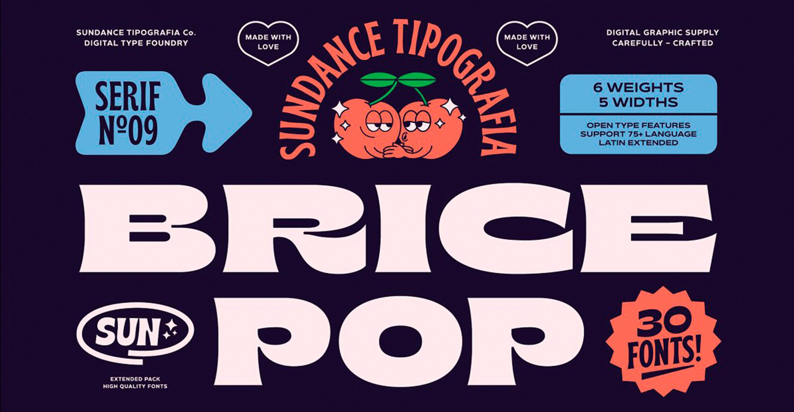
Designed by Sundance Tipographia
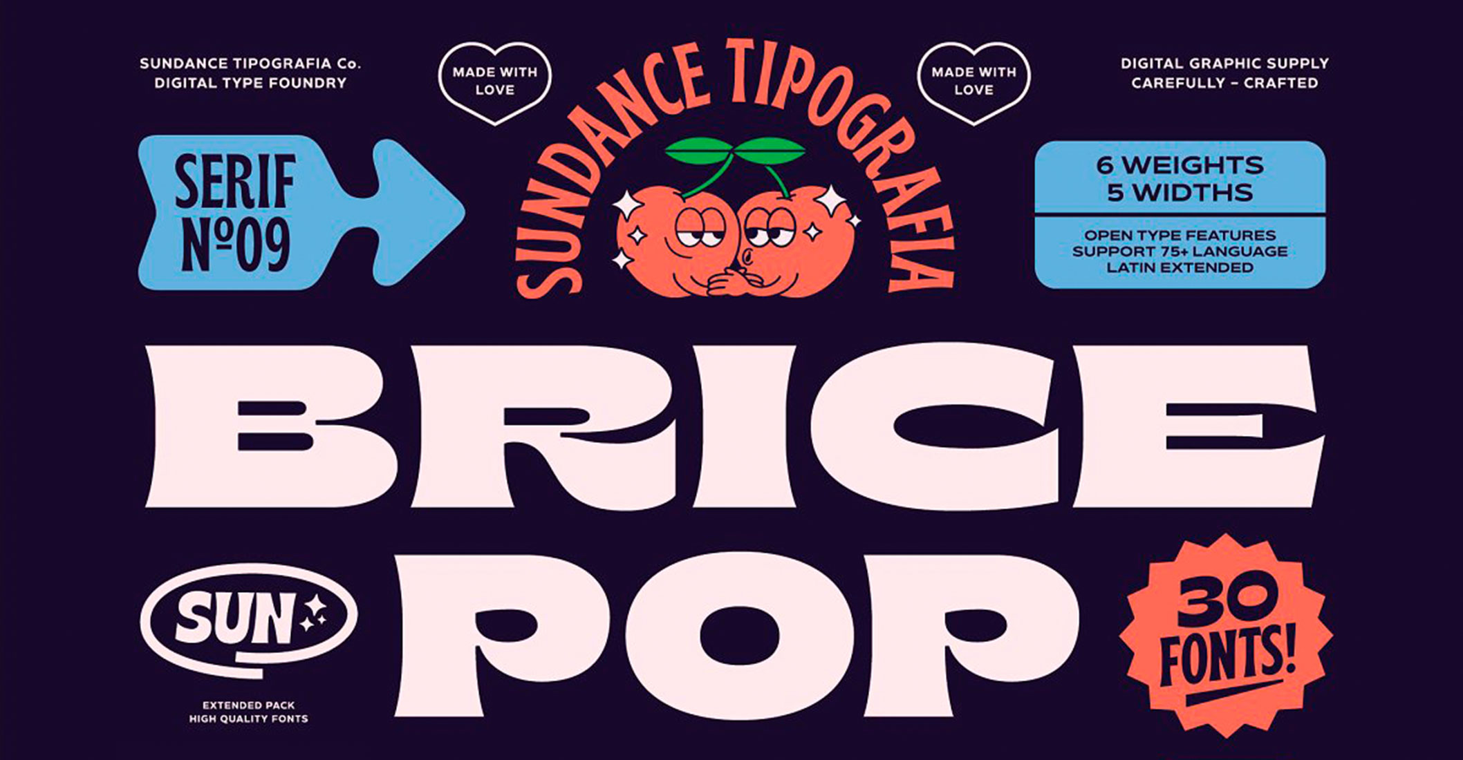
Designed by Sundance Tipographia
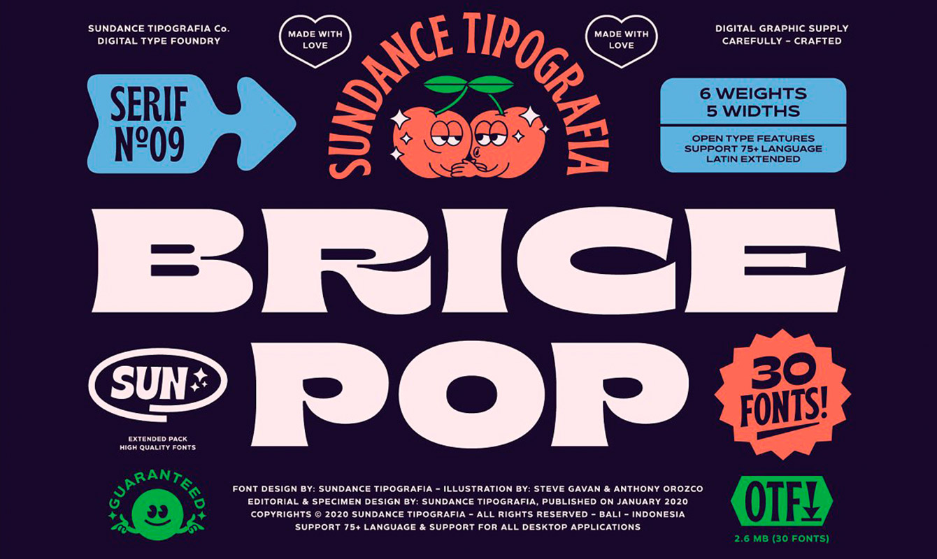
Designed by Sundance Tipographia
Brice is a so-called display typeface. It’s intended for use in large headings, instead of body text. As you can see, they’re often a bit more eccentric than their counterparts used for body text. Brice has a strong personality, inspired by the funk era of the 80s. When you look at it, you just feel the good vibes it gives off. Which is also a good reminder that not every font can be used on any occasion. The font family itself is very large, with a lot of different font-weights and can be used in a lot of different languages. Despite its limited use, we think the typeface is just splendid and very well designed.
Good Hood – a retro feeling
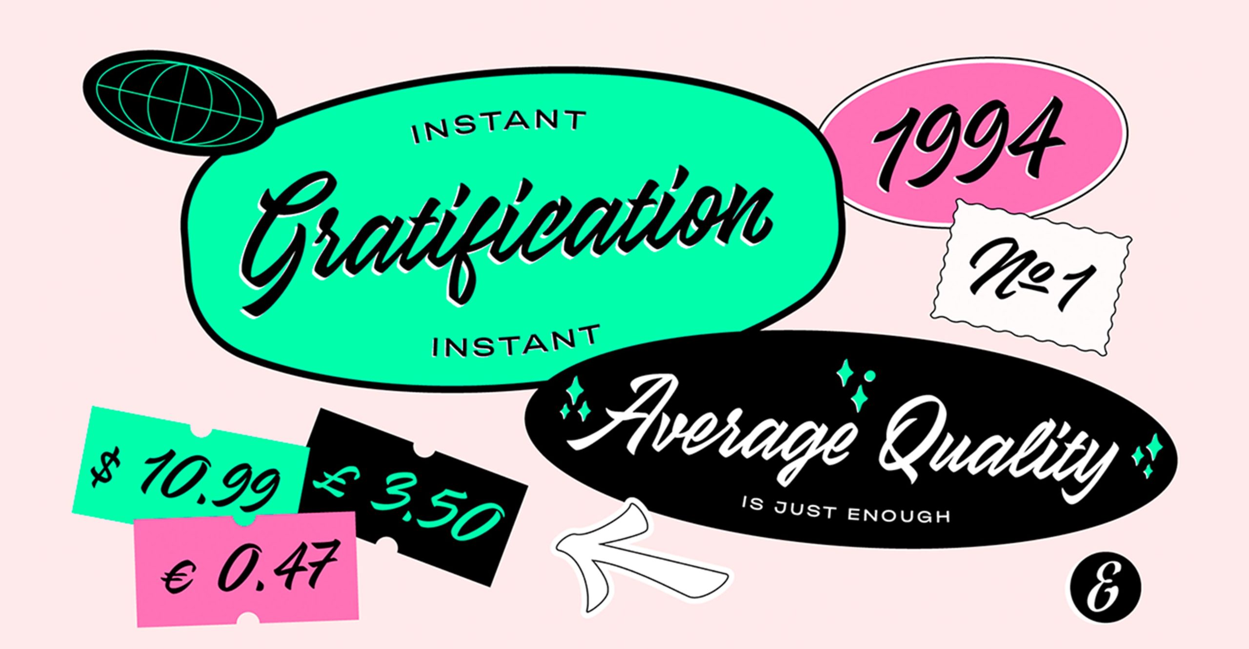
Designed by Eduard’s Pocket
Designed by Eduard’s Pocket
Designed by Eduard’s Pocket
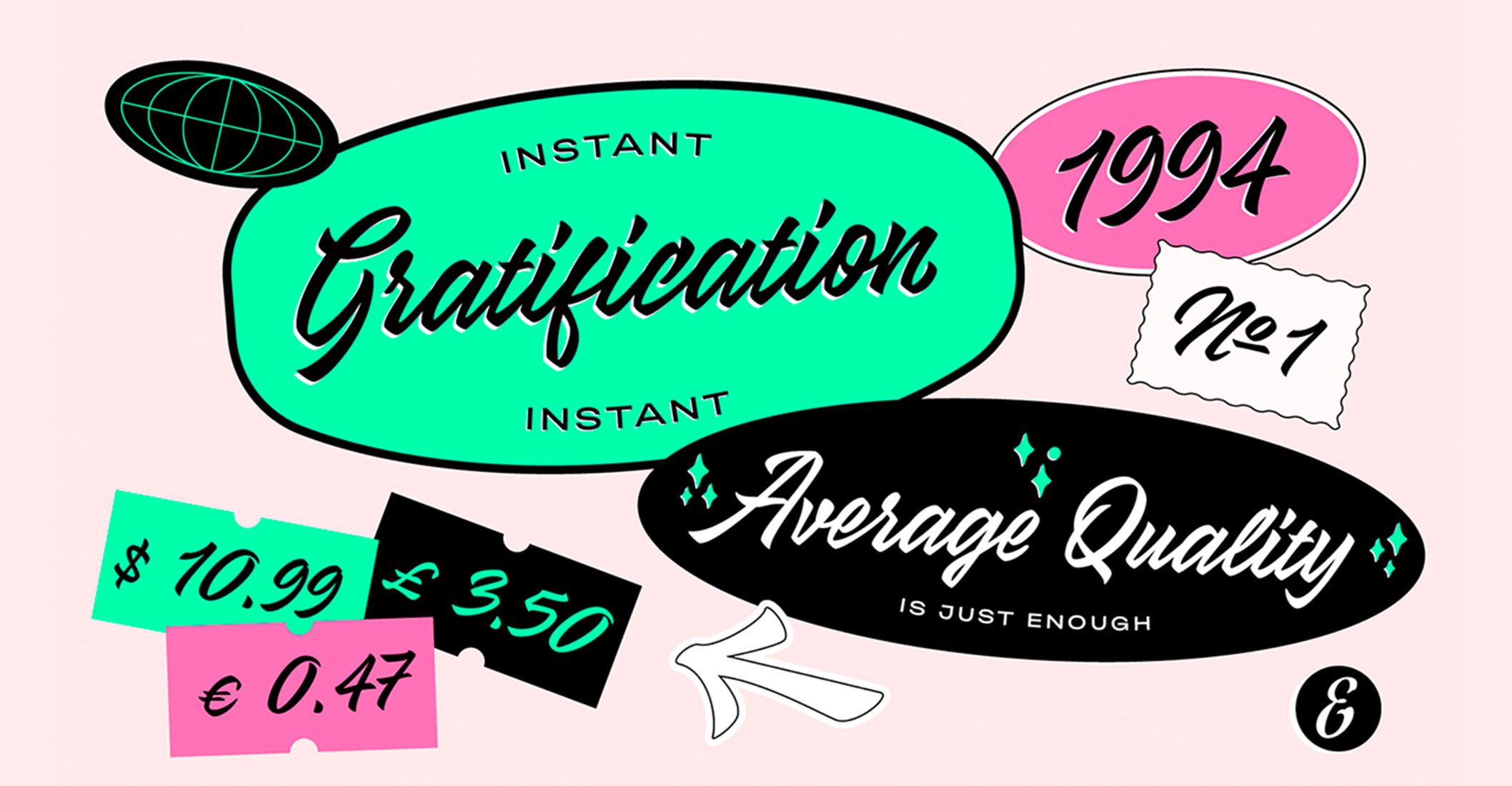
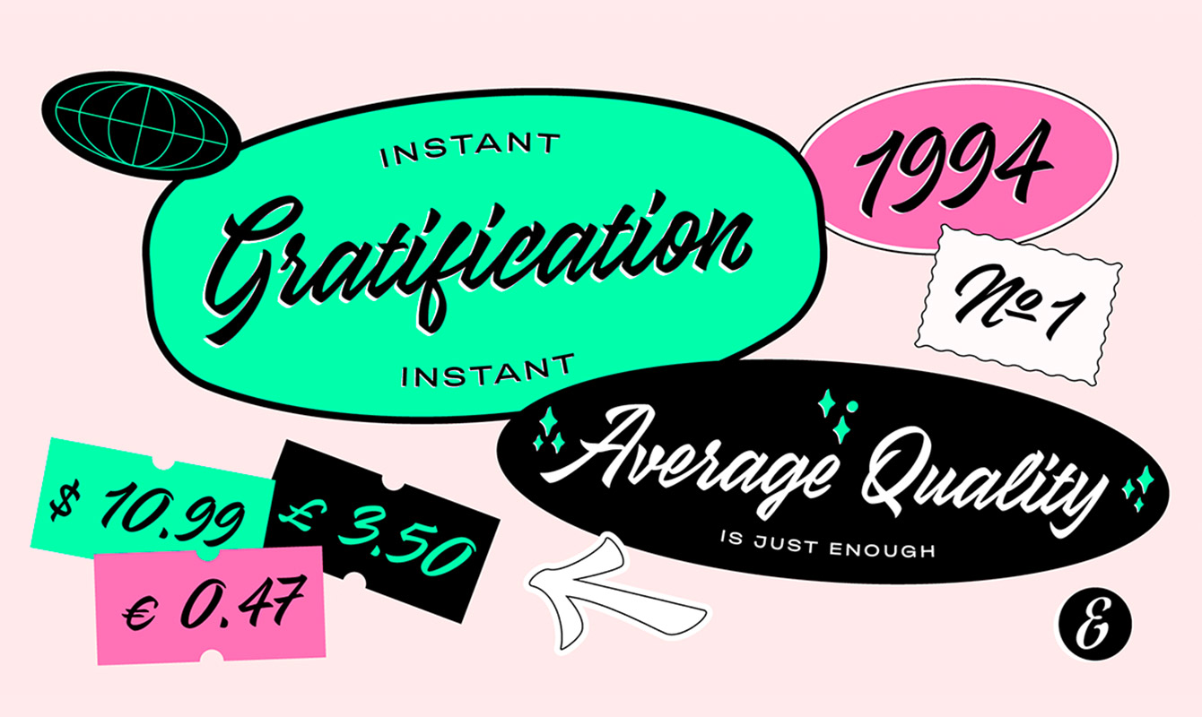
Like Brice, Good Hood is a font with a strong personality. It’s a script typeface, which mimics the fluid strokes of handwriting. The handmade style itself is inspired by sign painting, so the font would mainly be used to create a logo with or to use in special titles. Even though its use is also a bit limited, the work of Eduard’s Pocket is just impeccable.
Voyage – romantic & curly
Designed by Violaine & Jeremy
Designed by Violaine & Jeremy
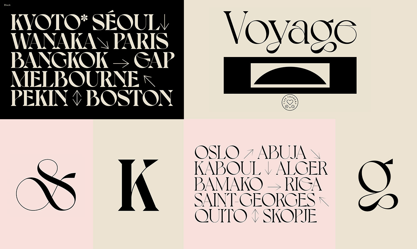
Designed by Violaine & Jeremy
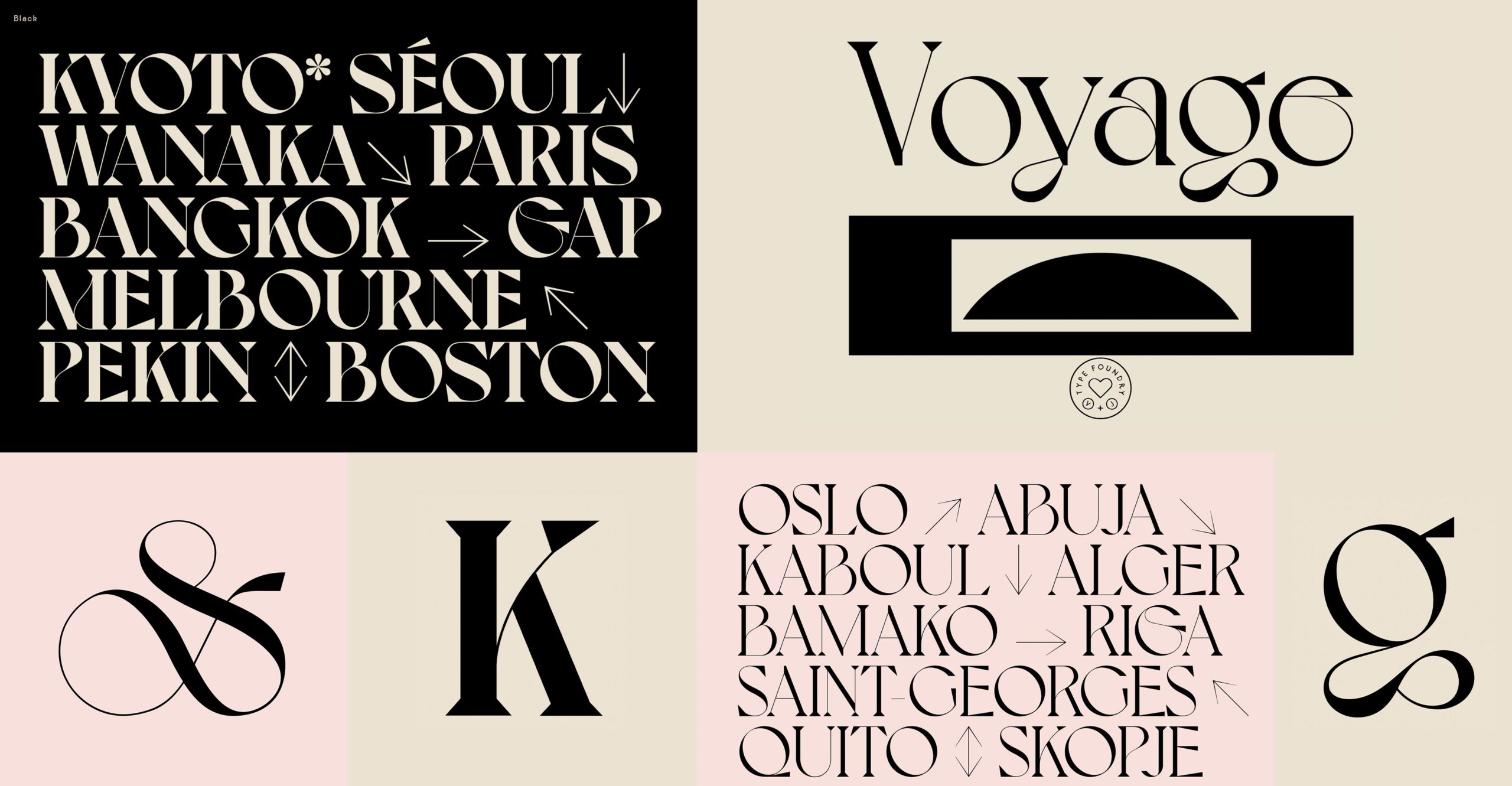
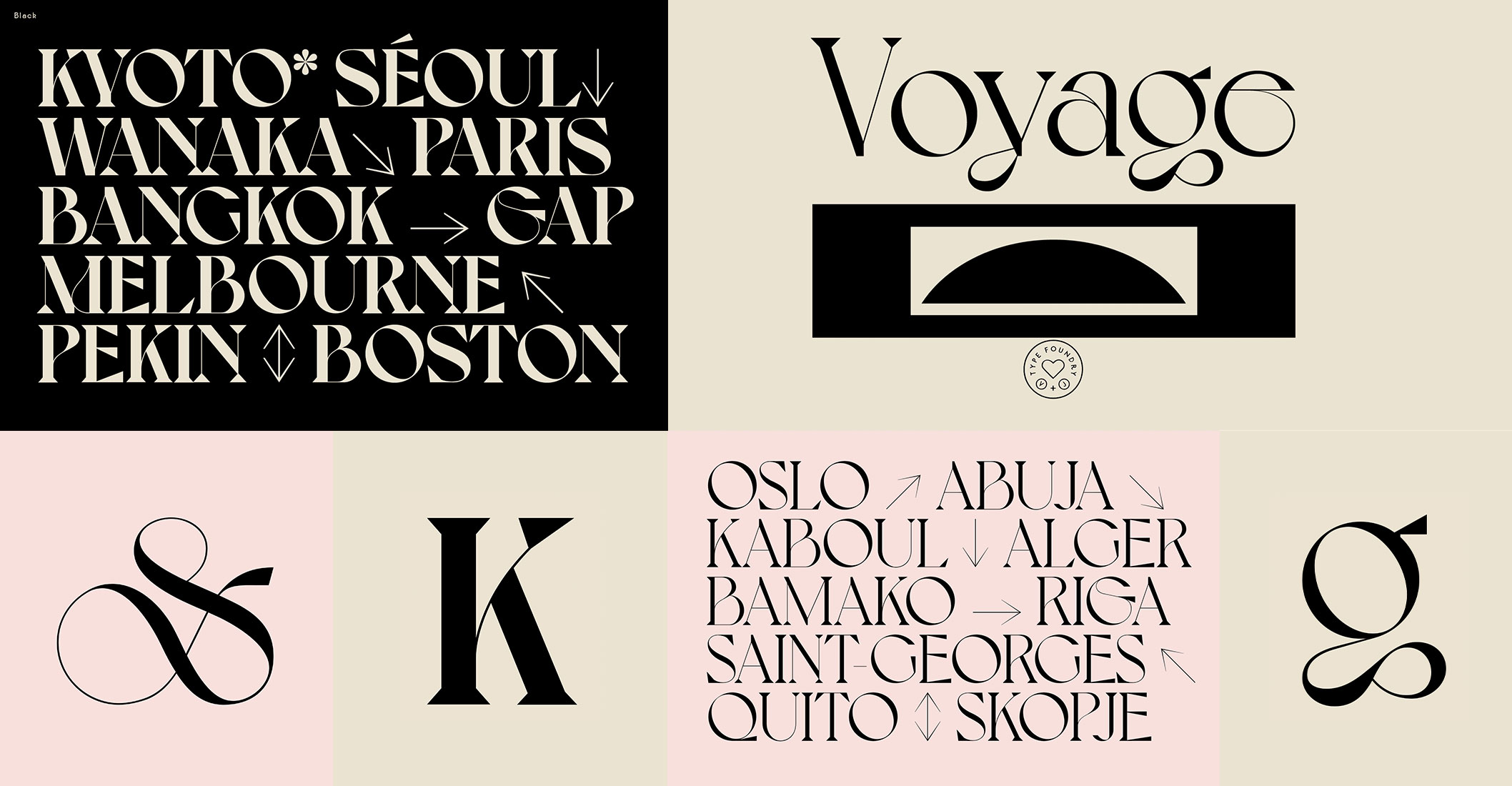
Voyage is another font that works really well for titles. It’s a very characteristic typeface that is as unconventional as it is playful. It’s very contrasting with a lot of power. As its name suggests, it’s inspired by a voyage or travelling.
Neue World – a vintage style

Designed by Mat Desjardins
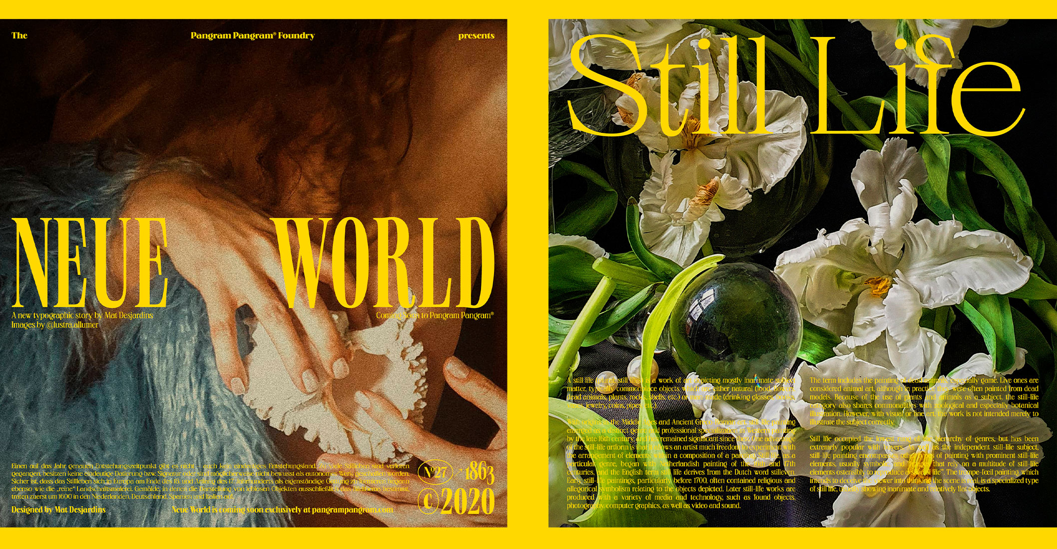
Designed by Mat Desjardins
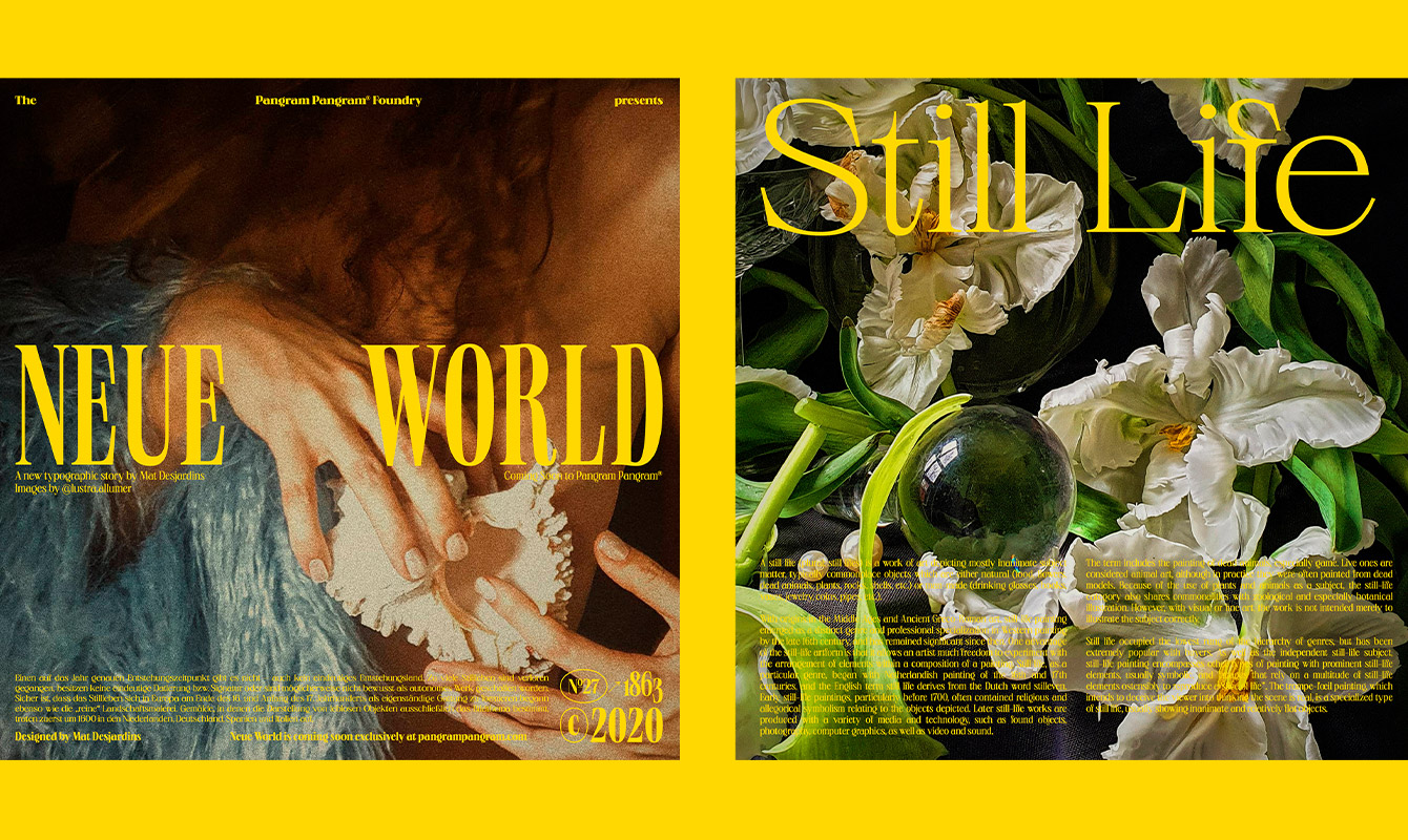
Designed by Mat Desjardins
Neue World is inspired by vintage typefaces. It works well for titles, but also for short texts, such as introductions. It’s a very versatile font since it can be elegant when used in light. But it can also be very contrasting when used in bold.
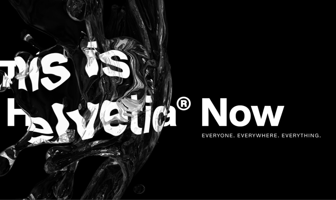
Helvetica Now – a modern classic with a second youth

Designed by Monotype
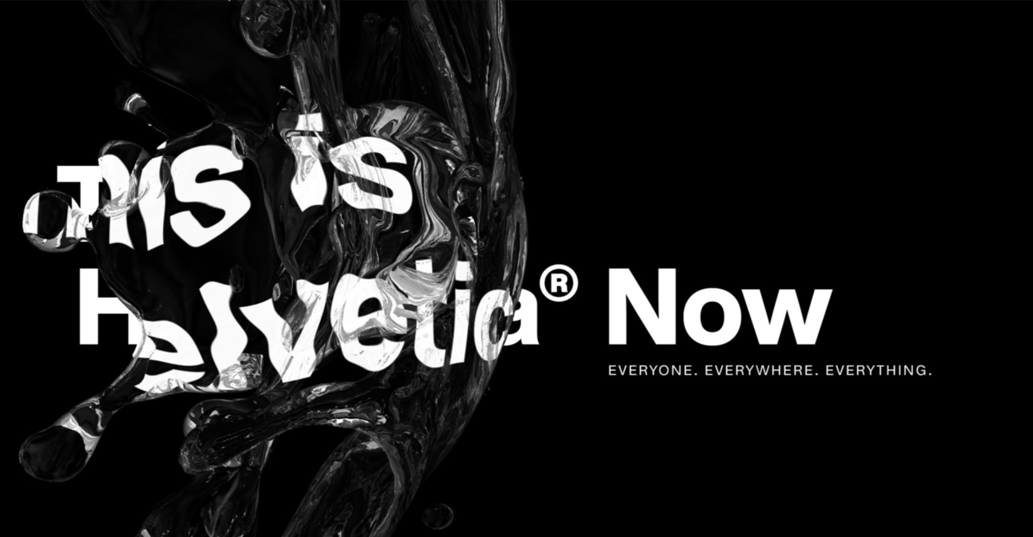
Designed by Monotype
Designed by Monotype
Helvetica needs no introduction. It is one of the world’s most iconic and widely used fonts in the world. It works for everything: long text, title, logo, whatever you need! This impactful simplicity is what makes it easy to read and a favourite among graphic designers. In 2019, Monotype took up the impossible challengeof giving Helvetica its second youth. They revamped the whole font family and called it Helvetica Now. It was a daring initiative to tackle such a legendary font, but we like the result!
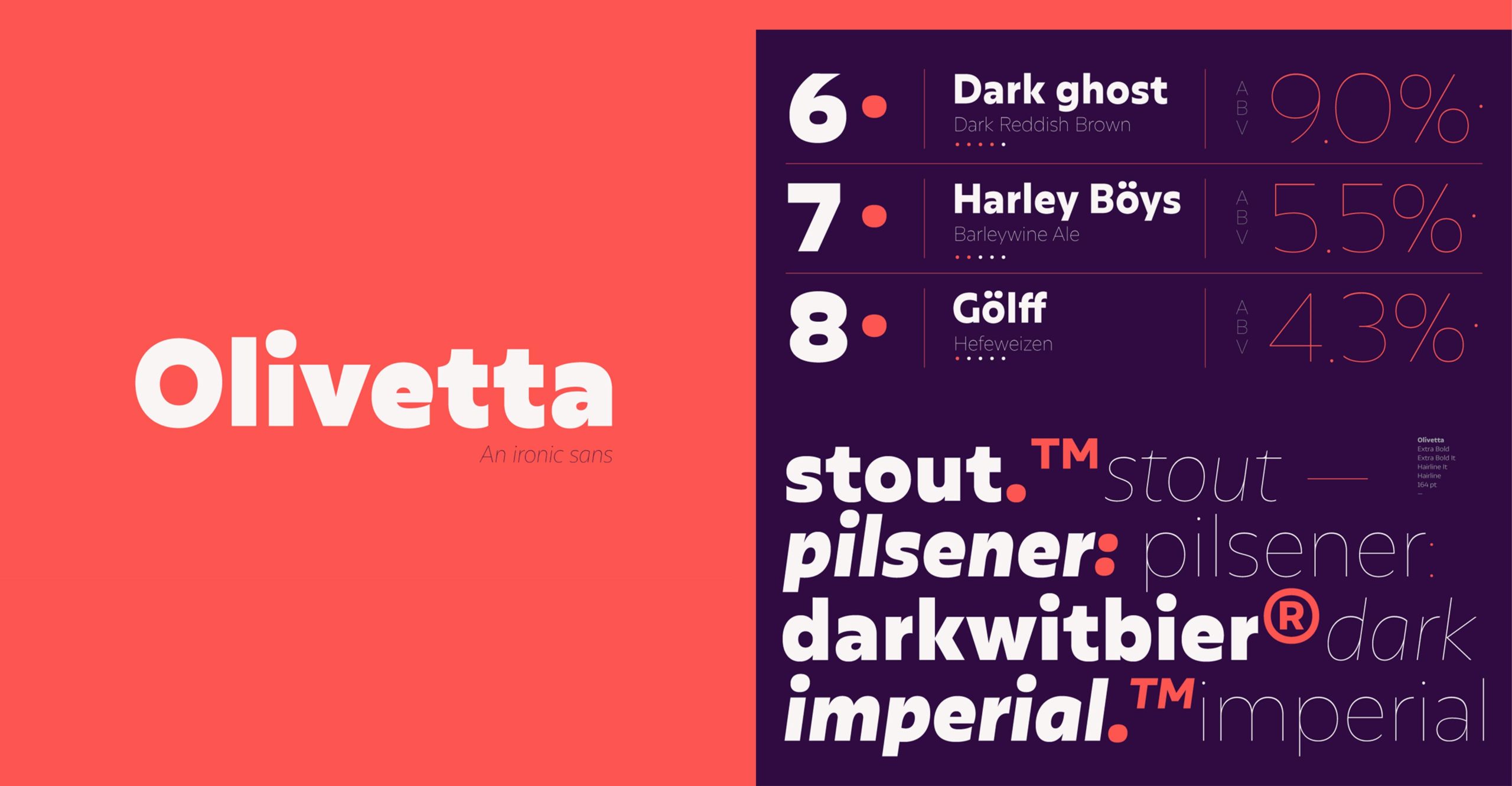
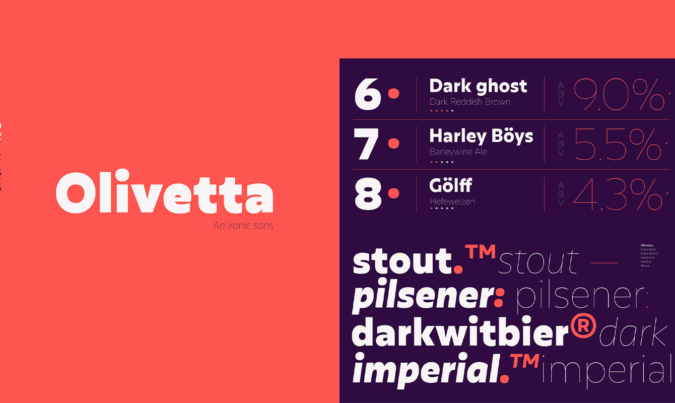
Olivetta – modern, yet personal
Designed by Alfonso Garcia

Designed by Alfonso Garcia
Designed by Alfonso Garcia
Olivetta puts us in a good mood straight away. Sometimes, ‘modern’ fonts lack a bit of personality, but this cannot be said about Olivetta. Despite her simplicity, she looks very friendly, both used in titles as in body text. She’s the perfect choice for a brand identity that wants to convey good vibes and confidence without taking itself too seriously.
Research & typography selection by Pablo Boulanger / writing by Louis Liekens

